
Nodal App
A social media platform that brings together physical practitioners and their communities.
Published:
Nodal — Case Study
Overview
Nodal is a social platform designed for communities engaged in physical activities. The social media landscape is changing fast, but many of the top platforms seem to focus on driving more and more eyeballs. Research indicates that most people are concerned with the direction these platforms are going in — user experience has drastically changed, as they prioritize consumption over creation and dialogue.
Nodal is based on a simple idea: a thoughtful social platform that brings physical practitioners and their communities together.
Problem Statement
The general direction that popular social media platforms are heading in doesn’t allow for nuance or discourse. It’s mostly driven to gain as much attention as possible and keep people scrolling. Because of this, the user experience for those who’d like to share insights into their physical training and create dialogue is hindered by the distractions built into these platforms.
Proposed Solution
Modern social media meets old-school forums. The solution would be to create an ad-free social media platform with a mix of “feeds” and commenting capabilities, while simultaneously creating a more intimate semi-private space where groups can share and discuss on a smaller scale.
Research
- Research focused on understanding why and how people share their physical training on social media and why they choose specific platforms.
- One-on-one interviews provided qualitative insights into platform preferences, while surveys offered quantitative data on social media habits.
- Market research analyzed common UI patterns across top and niche platforms.
- Key insights: Instagram is the top platform for training-related content; users feel platforms don’t prioritize their interests due to ads and algorithms.
- People share their physical training to document progress, grow their businesses, and connect with like-minded individuals.
Personas
Through my research, I found a split between coaches, teachers, and therapists who wanted to share their knowledge and grow their businesses, and those who wanted to share their progress with like-minded practitioners. Since the purpose of the project was to create a minimum viable product, any potential business features would come further down the line to support those coaches, teachers, and therapists.
Persona 1: 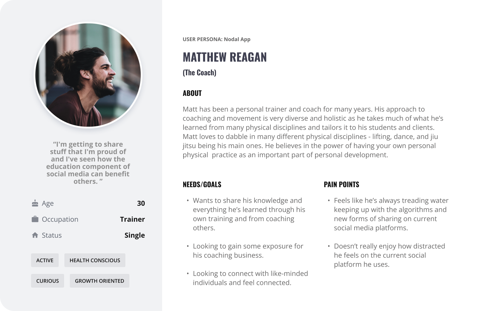
Persona 2: 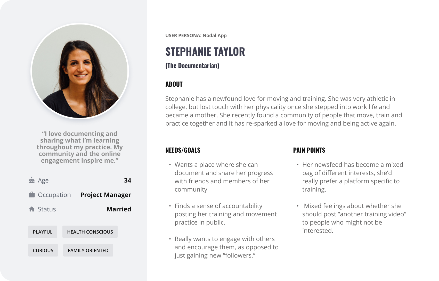
Information Architecture
The sitemap went through many variations. It was a great exercise in understanding where key features would be placed. In this case, the two main features were “Projects” and “Spaces,” and I wanted them to be easy to find in the interface. In my first versions, I had “Projects” as a sub-feed under the Home screen, which caused confusion during testing — testers could not understand where to find their projects. It became clear that the importance of the “Projects” feature didn’t match its original placement. The sitemap slowly came together as I tested lo-fi wireframes. 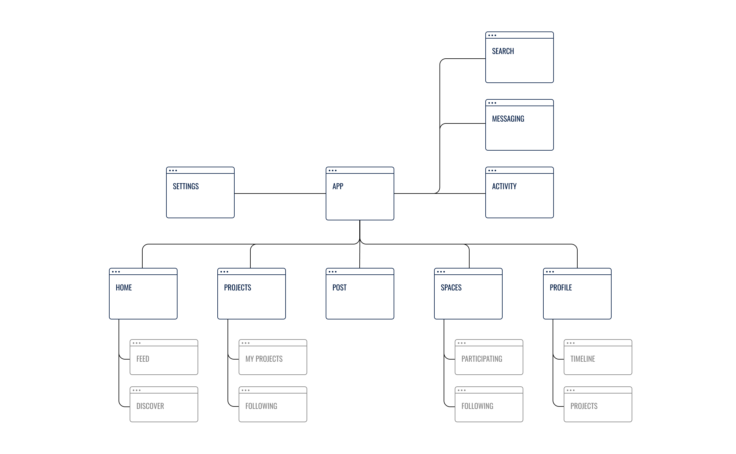
Wireframes & Prototypes
Sketches: Drawing out different screens that highlight key features while also adhering to familiar UI patterns of other social media platforms for ease of use. 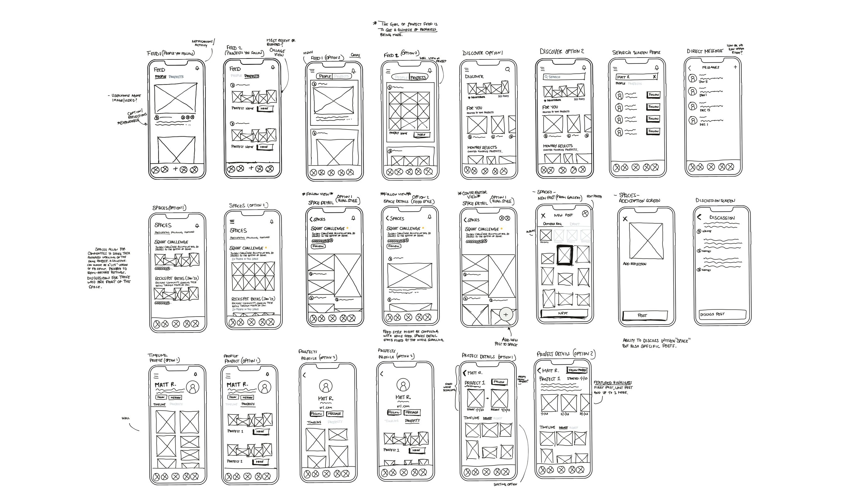
Usability Testing
Usability testing for Nodal revealed design issues in the “Projects” and “Spaces” features. Five users tested the prototypes, uncovering key patterns like confusion between direct messages and discussions, and users expecting to start projects from the feed. Insights showed that the concept of semi-private “Spaces” wasn’t intuitive, but users appreciated creating projects separately from posts. Recommendations included adding a “Projects” tab, making discussions more accessible, and merging discussions with messages. Some features, like follower counts, were considered low priority.
Final Designs
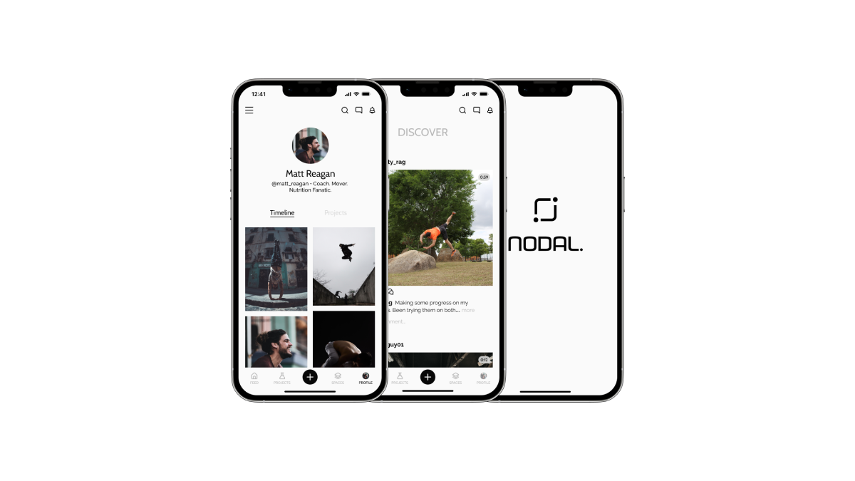
Feeds & Messages: I streamlined many of the pages and features from Instagram down to the most necessary ones. My emphasis was on a minimalistic and user-friendly design, allowing pictures and videos to guide the app’s visual direction. The UI patterns are heavily influenced by the VSCO app. 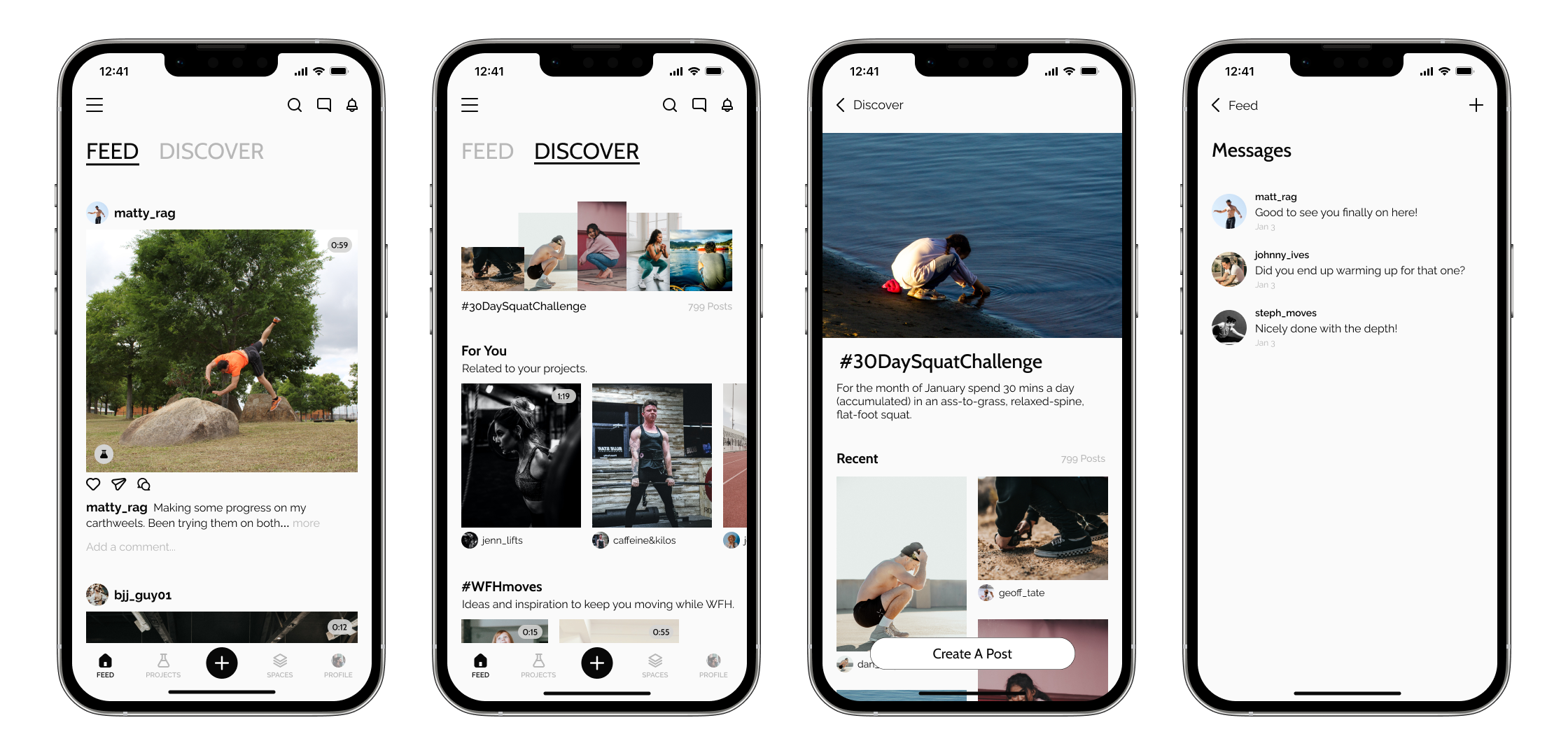
Spaces Overview: After testing, I created a separate tab within the navigation that allowed for more awareness of the “Projects” feature. “Projects” allow users to highlight something they’re working on and show their progress along the way. Documenting progress was something that emerged as an important reason people share their journey publicly. 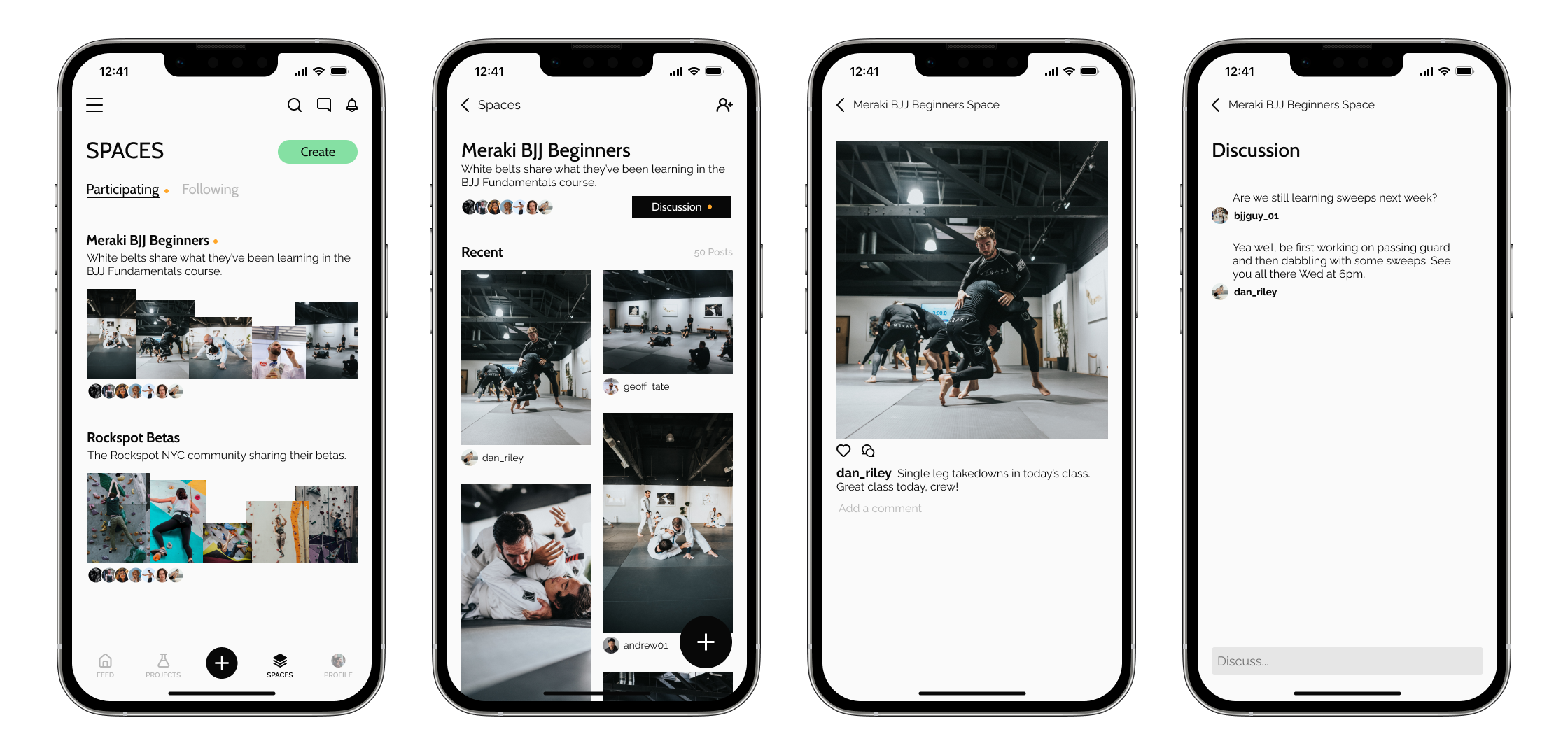
Projects Overview: Spaces allow groups of people to come together and privately or semi-privately share the things they’ve been working on together. (Think: Facebook Groups Lite) 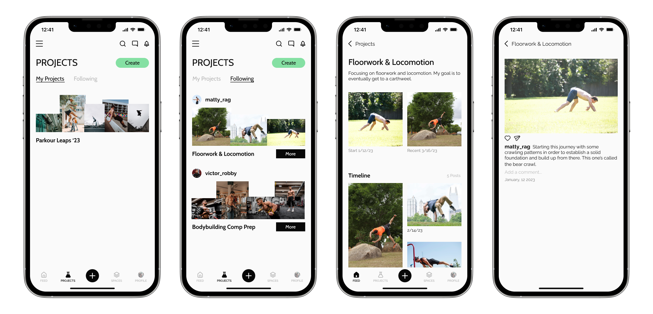
Next Steps
- Continue exploring the balance between the intimate nature of “Spaces” and the public sharing/following experience.
- Test different ways to display photos and videos within “Spaces” (e.g., gallery block, scrollable feed).
- Further iteration needed for “Discussions” to avoid similarities to Facebook Groups.
- Refine branding, UI, and video player interface for a more aligned user experience.
- Clarify notification distinctions and the “Follow” experience for users and projects, ensuring separate notifications for “Spaces” and “Discussions.”